
UWP: Create Custom XAML Control
Sunday, August 28, 2016

In this tutorial I will demonstrate how to make your own custom XAML control for Universal Windows Platform application. This is very handy way of making your app more modular and responsive. For this tutorial I will make "Speaker" UI control, for some of our conference or event Apps.
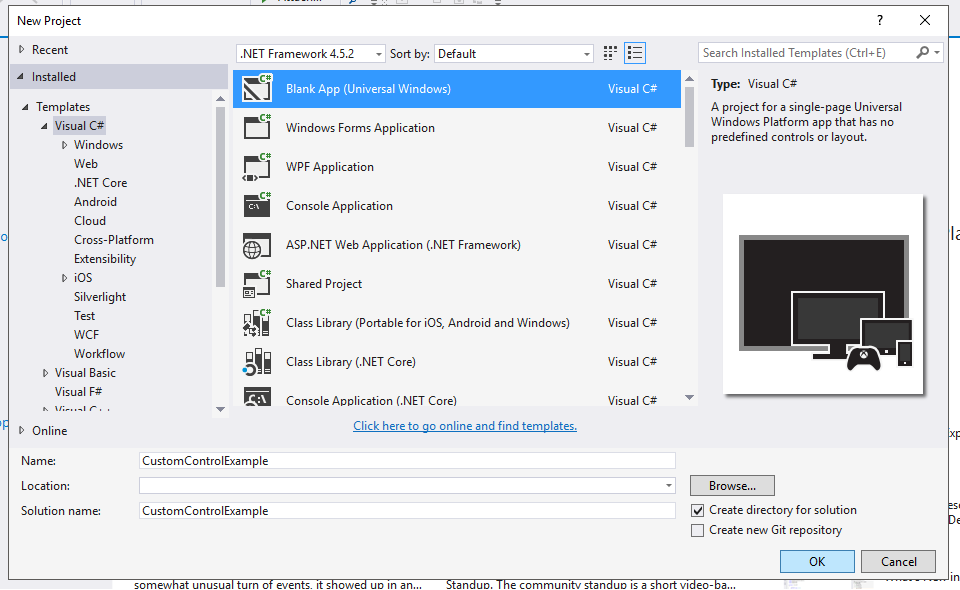
First we need to create new UWP App:
Steps: File -> New -> Project -> Visual C# -> Blank App (Universal Windows) -> Type new name -> Ok
This was pretty easy so we can move to a "hard" part.
I will create three folders in my project, one called Views, one called CustomControls and of course Models folder for my classes, this is not necessary but I will make those two folders to separate my views and custom controls.
In my Views folder I will add new blank page called SpeakersView.xaml and I will add new class in my Models folder called Speaker which looks like this:

This is our simple Speaker class with basic properties, now we will try to make our visual presentation for Speaker in SpeakerView.xaml.
When you have need to share same ui control across your app there are two ways to do that. First one is to combine default controls to make our own custom control, as I mentioned I will make Speaker control for one of my apps, and the XAML and code behind will look like this:

And code behind SpeakersView.xaml.cs

When I run this code I will get this kind of result:

For those who are not familiar with binding I will try to explain as short as possible. In my XAML view I create one GridView with DataTemplate, everything inside of data template will represent the items for my GridView. I used these couple of built in controls to make this "layout" for my speaker... and the for the controls is data in code behind class in my ObservableCollection of Speakers, as you can see I am using just one element in my list but if I want to have multiple speakers I do not need to change code in my XAML view, I just need to add new element to a ObservableCollection and new Speaker will appear in View.
Photo, first name, last name and company I am binding it to a Speaker model class which use ObservableCollection as a list of data and Speaker as a Model for this "properties".
Now everything looks great but what if I need to use this Speaker layout in again my App or I have similar project that I work on it do I want to write this same lines of code again? Answer is no. In order to make this modular and more practical I will create my own custom control which will be easier to use sometimes again.
Create custom control:
I will right click on my folder CustomControls -> Add -> New item
On a left side choose XAML and select UserControl, for name I will use SpeakerControl and click Add

We can copy xaml code which was representing our speaker in SpeakerView.xaml to this SpeakerControl.xaml inside of Grid. This is not it, we need to make some changes and add some code to make this work.
Now we have to make dependency properties for our controls in side of stack panel we need these for data binding. Go to SpeakerControl.xaml.cs in order to create dependency property we can use code snippet: propdp + tab + tab
When you hit that code snippet you will see that it will generate one public property for you and one static readonly dependency property which we can use to bind data to our controls inside of our custom controls.
And it looks like this:

In the Register part you can see that we define, name, type for our property, and the type of class which this property belong. After you make dependency properties for all the controls in side of our custom control, make sure to do build your project. It is very important to build project for our next steps.
Now we can go to XAML and make some edits to our controls, basically we need to bind content of our controls (source, text...) to the dependency properties like this:

You can set this binding via UI in Visual Studio, but for me this is simple and easy. As you can see we are binding our content values to a dependency properties and we are using ElementName property and set it to userControl which is default one for user controls and it is defined here at the top:

After this we can go back in our SpeakerView.xaml and instead of that code block we can now use our new custom control like this.
First we need to add "reference" to our "CustomControls" folder like this:

after that we can use our custom control in XAML like this:

In my code behind at speakersList I will add one more speaker to show that binding and data template works with custom control.

And now my app looks like this:

That is it, you can find full code and project on my GitHub page here.
I hope this tutorial was helpful for you... and I hope that you have learn how to make custom XAML control in UWP. Share this blogpost with your friends if you want...
Best regards! Almir Vuk | AV Development | https://almirvuk.blogspot.com/


2 comments
I want to custom control that base on RichEditBox but it did not work and I ask in http://stackoverflow.com/questions/43015661/how-to-custom-control-base-on-other-control
ReplyDeleteHvala ti puno :D
ReplyDelete