Xamarin.Forms: Our (my) first very simple Custom XAML Control implementation
Monday, November 27, 2017

In this blog post we will be making our first custom control, this will be very simple control using XAML in Xamarin.Forms.
There is a lot of reasons to create our own custom controls, and the main reason is to make our code more maintainable.
In this tutorial I will make simple speaker control which will hold one Image, and couple of Labels, something like this:

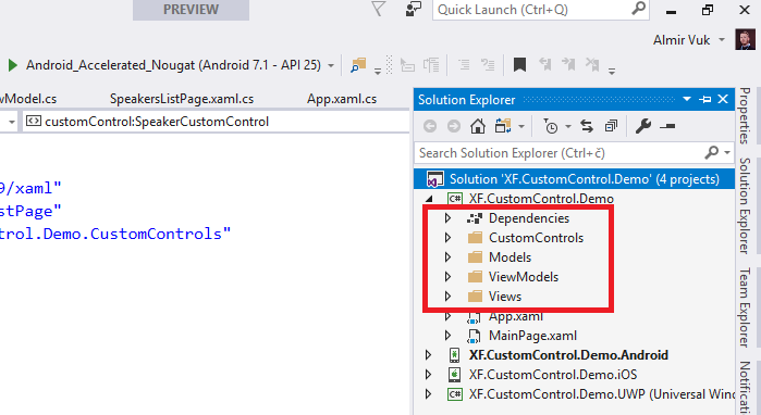
As always we will start with our basic "architecture", create these folders in your project:


That is not ok if we want to have maintainability in our app.
To be fair this is very simple example but the logic is the same. Now I want to create my first custom control which will hold this image, and two labels, after that I want to use that control and to reduce the number of lines of code.
Add new ContentView in CustomControls folder called SpeakerCustomControl. First step that I will do is to "extract" that grid from ListView and use it in our new custom control called speaker. So XAML of our control will look like this:
You can see that I removed those Binding elements and every control in this xaml page has a x:Name property, this will be very helpful for us because using that name property we will be able to access these controls in our new control.
And now the main part of our tutorial is a code behind our content view.

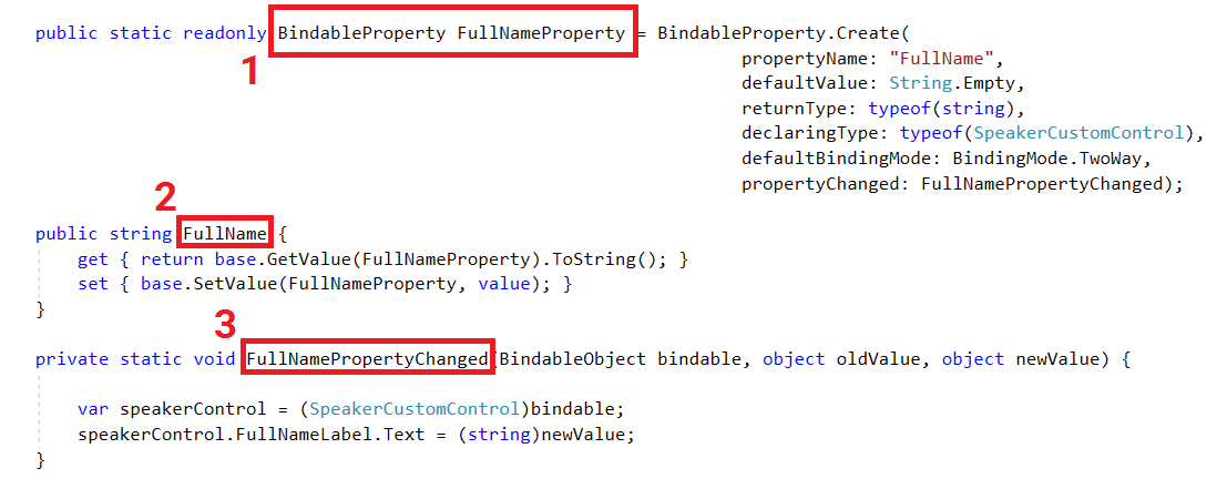
These are the main parts:
- You need to have static readonly BindableProperty. To create our bindable property we will use BindableProperty.Create method which has couple of properties that we define. Properties are quite self-explanatory. You can find more about this topic here.
- Our property of type string which will hold our data
- Static method which will be invoked when data of our property is changed.
This code from image above is everything that we need for one of our properties, know we need to implement the same logic for other two properties like this:
Now our SpeakersListPage is this:
To use our custom control we need to add their namespace to our xaml: and we can do that with this xaml syntax:
After that in our xaml we can use it with following syntax:
And now if I run my app I will get this result: As you can see the result is the same, but we are using our new custom control. Now we can use it in more pages, with few lines of code, with this approach it is more maintainable for us and code is more clean.
I hope that this blog post was helpful for you, this was not a longest blog post in the world but I hope that you get the point of it. Code example and project is on my github profile, you can find repository here: https://github.com/almirvuk/XF.CustomControl.Demo
Best regards! Almir Vuk


2 comments
I am getting an error:
ReplyDeleteNo property, bindable property, or event found for 'PhotoUrl', or mismatching type between value and property.
Very Informative Post.
ReplyDelete